

The Flexible Box Module, usually referred to as flexbox, was designed as a one-dimensional layout model, and as a method that could offer space distribution between items in an interface and powerful alignment capabilities. This article gives an outline of the main features of flexbox, which we will be exploring in more detail in the rest of these guides.
The two axes of flexbox
When working with flexbox you need to think in terms of two axes — the main axis and the cross axis. The main axis is defined by the flex-direction property, and the cross axis runs perpendicular to it. Everything we do with flexbox refers back to these axes, so it is worth understanding how they work from the outset.
The main axis
The main axis is defined by flex-direction, which is four possible values:
`rowrow-reversecolumncolumn-reverse
The cross axis
The cross axis runs perpendicular to the main axis, therefore if your flex-direction (main axis) is set to row or row-reverse the cross axis runs down the columns.
Flexbox Properties -
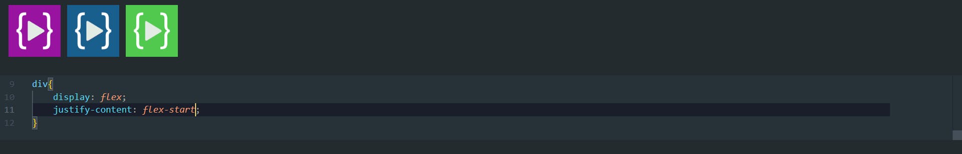
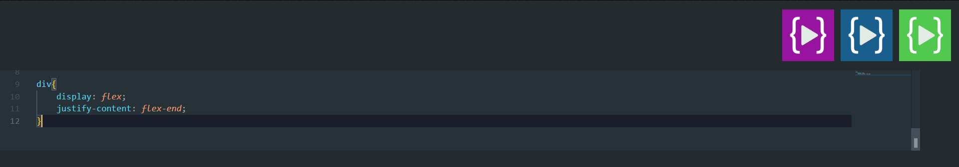
Justify-content -
Justify-content property, which aligns items horizontally and accepts the following values:
Justify-content: flex-start;Items align to the left side of the container.
Justify-content: flex-end;Items align to the right side of the container.
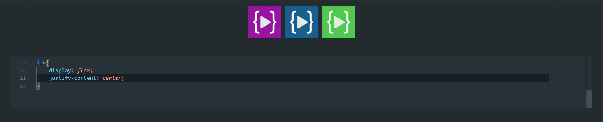
Justify-content: center;Items align at the center of the container.
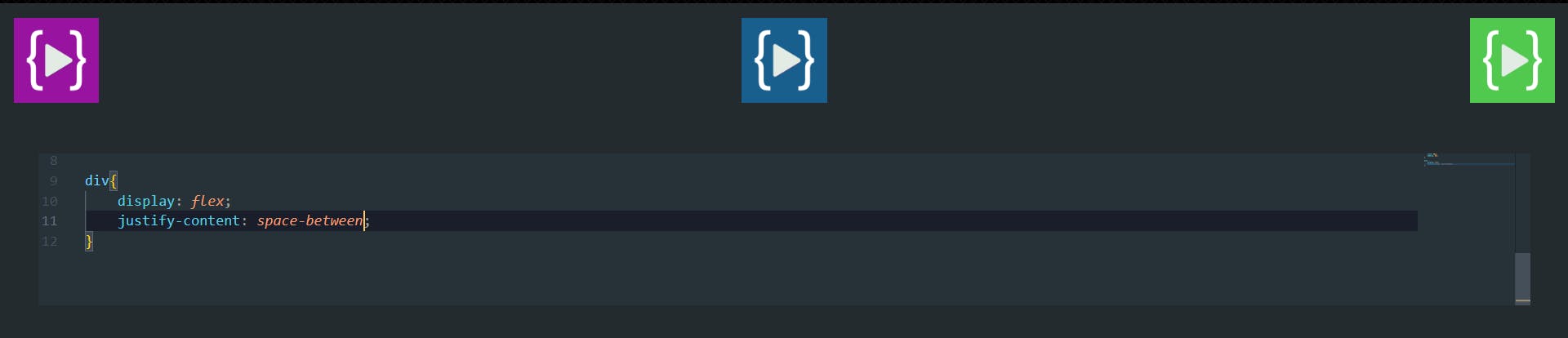
Justify-content: space-between;Items display with equal spacing between them.
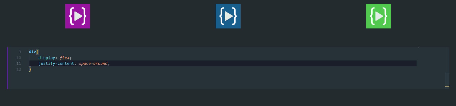
Justify-content: space-around;Items display with equal spacing around them.
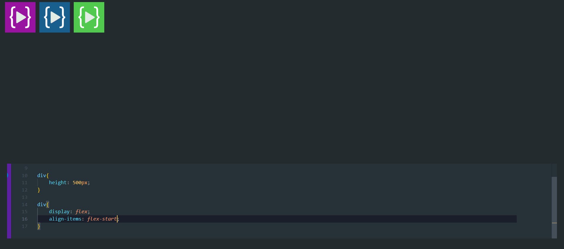
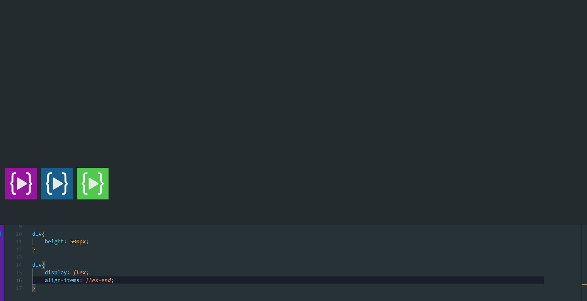
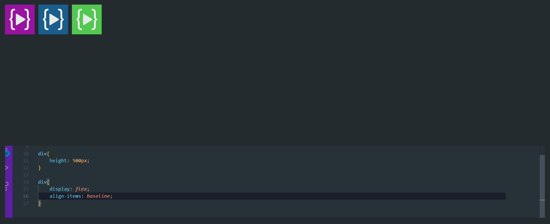
aling-items
The align-items property will align the items on the cross axis, and it accept following four values-
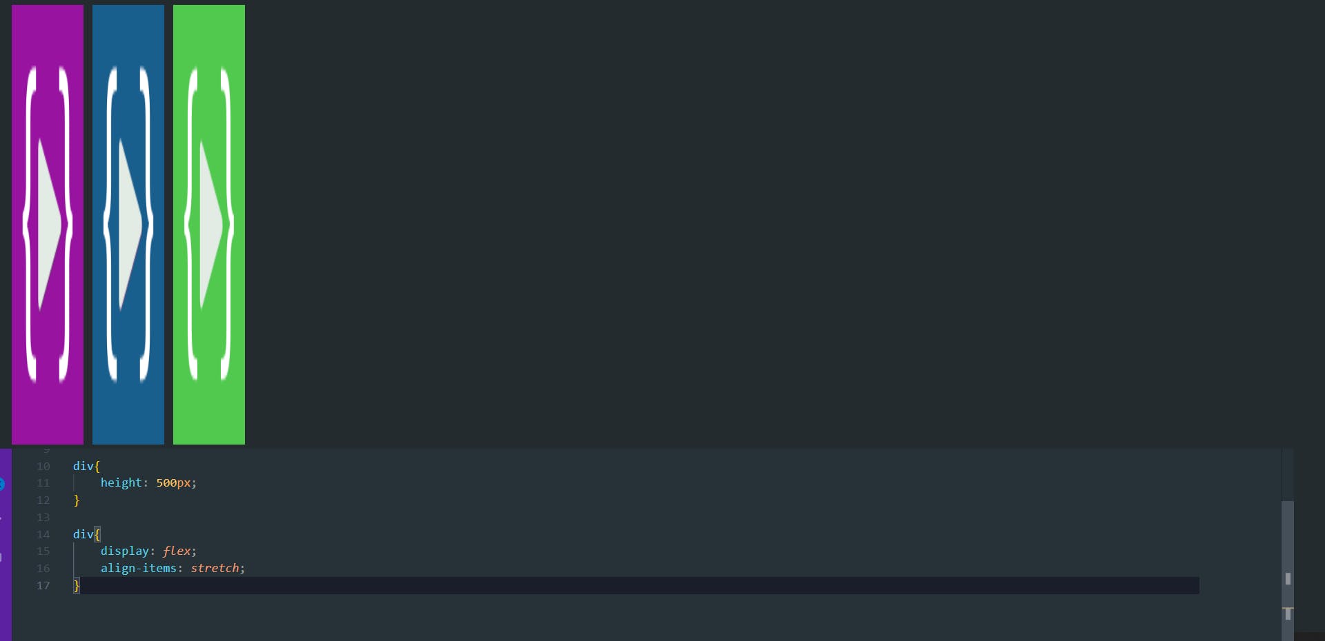
align-items: stretch;
The initial value for this property is stretch and this is why flex items stretch to the height of the flex container by default. This might be dictated by the height of the tallest item in the container, or by a size set on the flex container itself.
align-items: flex-start;
align-items: flex-end;
align-items: center;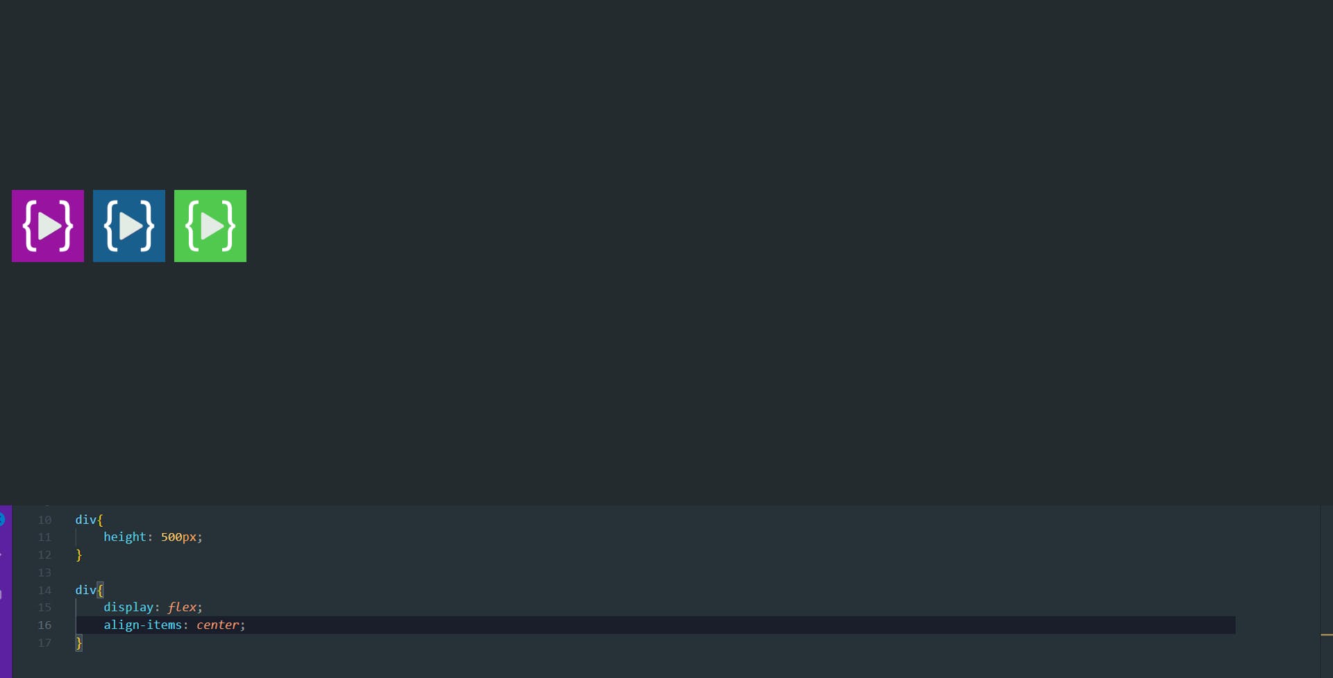
align-items: baseline;
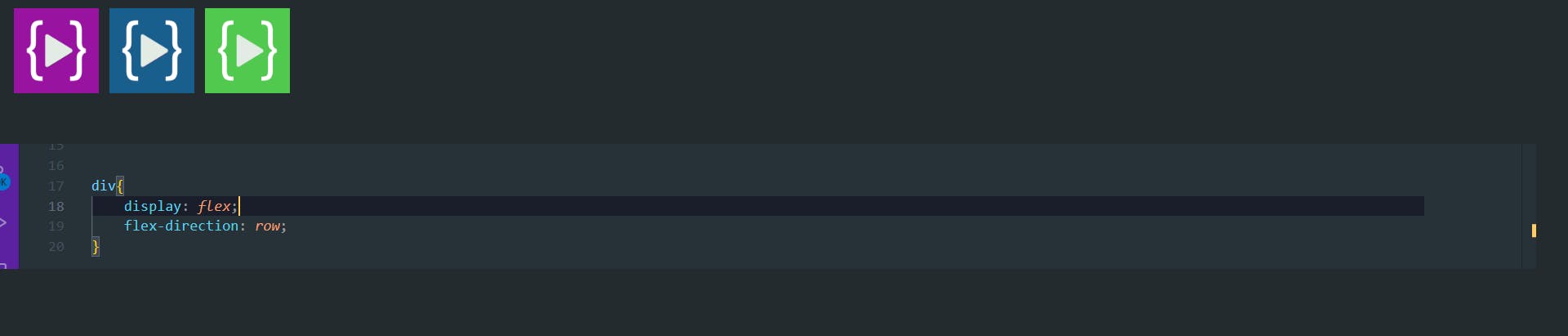
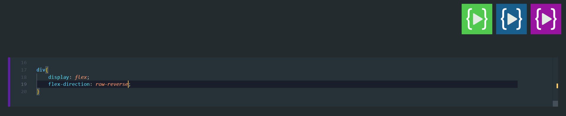
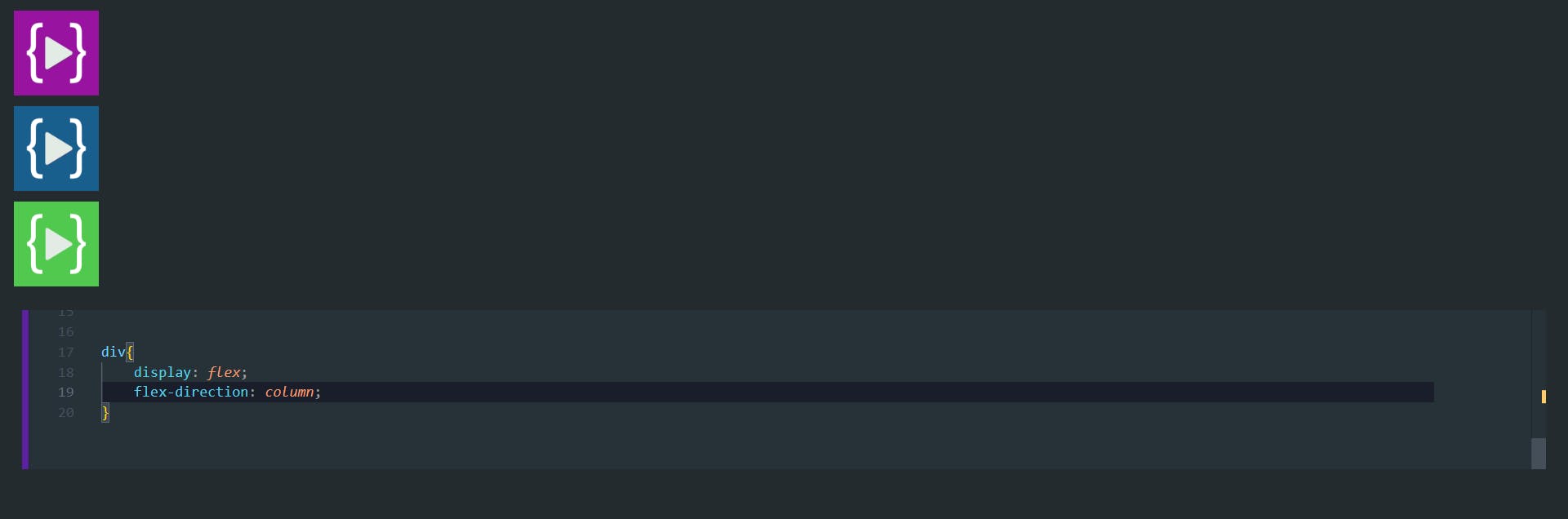
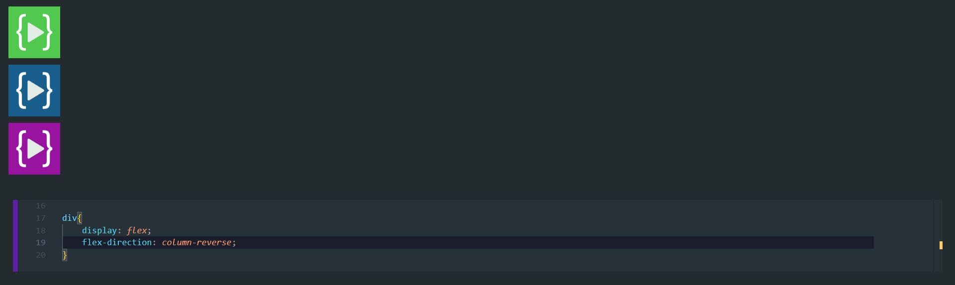
flex-direction
The flex-direction CSS property sets how flex items are placed in the flex container defining the main axis and the direction (normal or reversed).
flex-direction: row;
flex-direction: row-reverse;
flex-direction: column;
flex-direction: column-reverse;
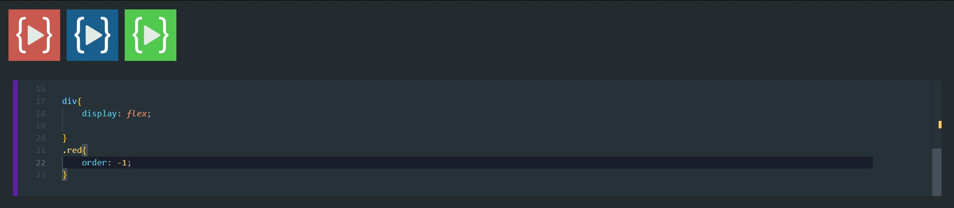
The order property
In addition to reversing the order in which flex items are visually displayed, you can target individual items and change where they appear in the visual order with the order property.
The order property is designed to lay the items out in ordinal groups. What this means is that items are assigned an integer that represents their group. The items are then placed in the visual order according to that integer, lowest values first. If more than one item has the same integer value, then within that group the items are laid out as per source order.
As an example, I have three items which is ordered as

- blue
- green
- red
Then if I want to change the order of red to first place we need to assign lowest value to that